Table of Contents
- How to Read This Color Mixing Chart
- Basic Color Mixing Chart
- How White Changes a Color
- What Happens When You Mix Complementary Colors?
- How to Make 17 Popular Paint Colors
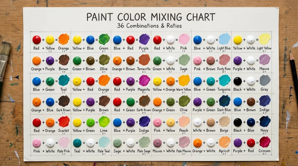
- 36 Color Mixing Recipes at a Glance
- How Different Ratios Change the Same Two Colors
- How to Fix a Color That Is Not Quite Right
- Paint Mixing vs Digital Color Mixing
- 5 Useful Digital Color Palettes
- 2026 Color Inspiration
- How to Make Your Own Color Mixing Chart
- Common Color Mixing Mistakes
- Frequently Asked Questions
- Sources and Further Reading
A good color mixing chart does more than tell you that red and yellow make orange. It should help you predict what happens when you change the ratio, lighten a color, mute it, or mix popular shades such as sage green, terracotta, mauve, teal, khaki, and dusty rose.
- Paint recipes: 36 useful starting combinations
- Ratios: Written in simple “parts” so they are easy to scale
- Useful for: Acrylic, craft paint, art, DIY, decor, and color studies
- Also included: Digital palettes with HEX color codes
- Important: Paint brands and pigments can produce slightly different results
How to Read This Color Mixing Chart
A ratio such as 2:1 means two parts of the first color for every one part of the second color.
Your “part” can be anything convenient: one brush load, one drop, one teaspoon, or one small scoop. What matters is keeping the same unit throughout the mix.
For example:
2 parts yellow + 1 part red
means twice as much yellow as red.
Start with the lighter or less powerful color when possible, then add the darker color gradually. Strong blues, violets, blacks, and some reds can change a mixture very quickly.
Important: These are practical starting recipes, not universal formulas. Pigment strength, opacity, paint brand, medium, and even the white or black you use can shift the result.
Basic Color Mixing Chart
Traditional paint color theory begins with red, yellow, and blue. Mixing two primary colors gives you the familiar secondary colors: orange, green, and violet.
| Colors | Starting Ratio | Approximate Result |
|---|---|---|
| Red + Yellow | 1:1 | Orange |
| Yellow + Blue | 1:1 | Green |
| Blue + Red | 1:1 | Violet / Purple |
| Red + Orange | 1:1 | Red-orange |
| Yellow + Orange | 1:1 | Yellow-orange |
| Yellow + Green | 1:1 | Yellow-green |
| Blue + Green | 1:1 | Blue-green |
| Blue + Violet | 1:1 | Blue-violet |
| Red + Violet | 1:1 | Red-violet |
How White Changes a Color
Adding white creates a tint. It makes a color lighter and usually softer.
| Mix | Starting Ratio | Approximate Result |
|---|---|---|
| Red + White | 1:4 | Soft pink |
| Blue + White | 1:4 | Powder blue |
| Green + White | 1:4 | Mint green |
| Violet + White | 1:4 | Lavender |
| Orange + White | 1:4 | Peach |
| Brown + White | 1:3 | Tan / beige |
| Black + White | 1:4 | Medium gray |
Better control: Add the darker color into the white instead of adding large amounts of white into the dark color. You will waste less paint and have more control over the final shade.
What Happens When You Mix Complementary Colors?
Complementary colors sit opposite each other on the color wheel. Examples include red and green, blue and orange, and yellow and violet.
When placed next to each other, these pairs create strong contrast. When mixed together as paint, however, they usually become less saturated and move toward natural browns, grays, or other muted neutrals.
| Complementary Mix | Starting Ratio | Typical Direction |
|---|---|---|
| Red + Green | 1:1 | Muted brown / neutral |
| Blue + Orange | 1:1 | Muted brown-gray |
| Yellow + Violet | 1:1 | Muted ochre / brown-gray |
This is useful when a color looks too bright. Instead of adding black immediately, try adding a tiny amount of its complement.
How to Make 17 Popular Paint Colors
These mixes are especially useful for decor, crafts, painting, mood boards, and Pinterest-style color projects.
1. Sage Green
Starting mix: 2 parts green + 3 parts white + a tiny touch of brown or red.
The white softens the green while the small amount of a warm complementary color takes away some of the brightness.
2. Olive Green
Starting mix: 3 parts green + 1 part yellow + 1 part brown.
Add more yellow for a warmer olive or more brown for an earthier result.
3. Teal
Starting mix: 2 parts blue + 1 part green.
Add white for a lighter teal or a tiny amount of black for a deeper version.
4. Seafoam Green
Starting mix: 2 parts green + 1 part blue + 4 parts white.
5. Terracotta
Starting mix: 2 parts orange + 1 part brown + a small touch of red.
For a lighter clay tone, add white gradually.
6. Rust
Starting mix: 2 parts orange + 1 part red + a small touch of brown.
7. Dusty Rose
Starting mix: 2 parts pink + 2 parts white + a very small amount of brown or muted green.
Add the muting color carefully. Too much can turn the mix gray or brown.
8. Mauve
Starting mix: 1 part violet + 3 parts white + a small touch of red or gray.
9. Peach
Starting mix: 1 part orange + 4 parts white.
Add a tiny touch of red if you want a warmer peach.
10. Coral
Starting mix: 2 parts red + 1 part yellow + 3 parts white.
11. Burgundy
Starting mix: 4 parts red + 1 part blue + a small touch of brown.
Add the blue slowly. Too much will push the mixture toward violet.
12. Khaki
Starting mix: 2 parts yellow + 1 part brown + 2 parts white + a tiny touch of green.
13. Cream
Starting mix: 8 parts white + 1 part yellow + the smallest touch of brown.
14. Caramel
Starting mix: 1 part brown + 1 part orange + 2 parts white.
15. Slate Blue
Starting mix: 2 parts blue + 2 parts white + a tiny touch of black or gray.
16. Periwinkle
Starting mix: 2 parts blue + 1 part violet + 4 parts white.
17. Moss Green
Starting mix: 2 parts yellow + 1 part green + a small touch of brown.
36 Color Mixing Recipes at a Glance
| # | Mix | Result |
|---|---|---|
| 1 | Red + Yellow | Orange |
| 2 | Yellow + Blue | Green |
| 3 | Blue + Red | Violet |
| 4 | Red + Orange | Red-orange |
| 5 | Yellow + Orange | Yellow-orange |
| 6 | Yellow + Green | Yellow-green |
| 7 | Blue + Green | Blue-green |
| 8 | Blue + Violet | Blue-violet |
| 9 | Red + Violet | Red-violet |
| 10 | Red + White | Pink |
| 11 | Blue + White | Powder blue |
| 12 | Green + White | Mint |
| 13 | Violet + White | Lavender |
| 14 | Orange + White | Peach |
| 15 | Brown + White | Tan |
| 16 | Black + White | Gray |
| 17 | Red + Green | Muted brown |
| 18 | Blue + Orange | Muted brown-gray |
| 19 | Yellow + Violet | Muted ochre |
| 20 | Green + White + Brown | Sage green |
| 21 | Green + Yellow + Brown | Olive green |
| 22 | Blue + Green | Teal |
| 23 | Green + Blue + White | Seafoam |
| 24 | Orange + Brown + Red | Terracotta |
| 25 | Orange + Red + Brown | Rust |
| 26 | Pink + White + Brown | Dusty rose |
| 27 | Violet + White + Gray | Mauve |
| 28 | Red + Yellow + White | Coral |
| 29 | Red + Blue + Brown | Burgundy |
| 30 | Yellow + Brown + White | Khaki |
| 31 | White + Yellow + Brown | Cream |
| 32 | Brown + Orange + White | Caramel |
| 33 | Blue + White + Gray | Slate blue |
| 34 | Blue + Violet + White | Periwinkle |
| 35 | Yellow + Green + Brown | Moss green |
| 36 | Orange + Brown + White | Warm clay |
How Different Ratios Change the Same Two Colors
Changing the ratio can be more useful than adding another paint color.
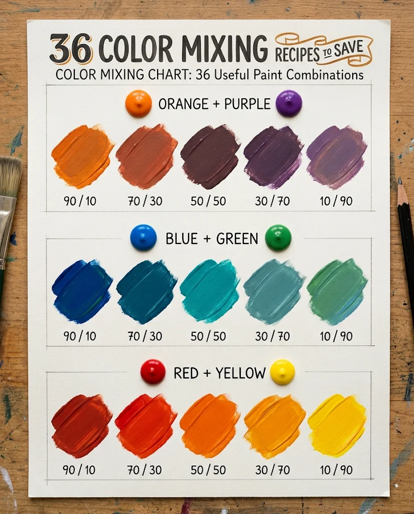
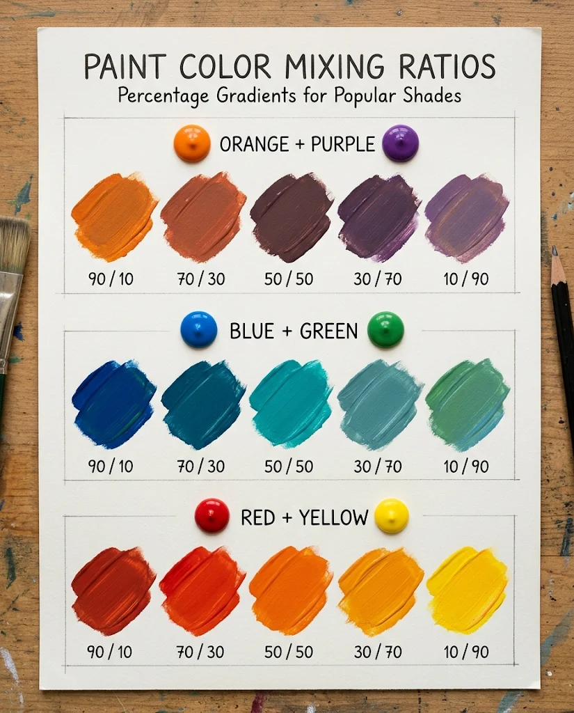
Imagine you are mixing orange and violet. A mixture dominated by orange will stay warmer. As you increase the violet, the result usually becomes cooler, darker, and more muted.
| First Color | Second Color | What Usually Happens |
|---|---|---|
| 90% | 10% | The first color changes only slightly |
| 70% | 30% | The second color becomes clearly visible |
| 50% | 50% | The strongest blend of both colors |
| 30% | 70% | The second color becomes dominant |
| 10% | 90% | Only a small influence from the first color remains |
Do not expect the same named shade every time. Two brands labeled “purple” can contain completely different pigments and produce very different mixtures with the same orange.
How to Fix a Color That Is Not Quite Right
The Color Is Too Dark
Add white in small amounts. Mix completely before deciding whether you need more.
The Color Is Too Light
Add more of the original base color rather than immediately reaching for black.
The Color Is Too Bright
Add a tiny amount of the complementary color. This reduces saturation without automatically making the mixture look black.
The Color Is Too Cool
Depending on the hue, a small amount of yellow, orange, or warm red can move the mixture warmer.
The Color Is Too Warm
A small amount of blue or cool violet can move many mixtures in a cooler direction.
The Color Turned Muddy
Stop adding more colors. Muddy mixtures often happen when too many pigments are combined.
Start a fresh batch with fewer colors and use very small adjustments.
Paint Mixing vs Digital Color Mixing
Paint and screen colors do not work in exactly the same way.
| System | Used For | How It Works |
|---|---|---|
| RYB / pigment mixing | Traditional art and paint | Physical pigments absorb and reflect light |
| RGB | Screens and digital graphics | Red, green and blue light are added together |
| CMYK | Printing | Cyan, magenta, yellow and black inks are combined |
| HEX | Web and digital design | A code identifies a digital RGB color |
Do not treat a HEX code as a paint recipe. A digital color can be defined precisely on a screen, but mixing physical paint to match it depends on the pigments available.
5 Useful Digital Color Palettes
If you are working in Canva, web design, branding, Pinterest graphics, or digital mood boards, HEX codes are more useful than paint ratios.
1. Earthy Green Palette
Tea Green: #CAEDB8
Ebony: #56694F
Chestnut: #963F2E
Aztec Gold: #CD9B59
Khaki: #EDE490
This palette works well for earthy branding, gardening content, cottage-style graphics, crafts, and warm interior mood boards.
2. Soft Sage Palette
Sage: #A8B59A
Warm Cream: #F4EEDF
Clay: #B86F52
Olive: #727A4A
Dark Brown: #4E4035
3. Dusty Rose Palette
Dusty Rose: #C98B91
Soft Blush: #E8C3C3
Cream: #F8F1E7
Mauve: #9A6F7A
Chocolate: #55403E
4. Coastal Palette
Seafoam: #B9D8CF
Powder Blue: #B9D4EA
Sand: #DECBA8
Warm White: #F5F2E9
Deep Teal: #356B6B
5. Autumn Palette
Terracotta: #B85C3E
Mustard: #C99B3D
Olive: #77764B
Rust: #994C35
Cream: #F1E6D0
2026 Color Inspiration
For current digital inspiration, Pinterest’s official 2026 Palette includes Cool Blue, Jade, Plum Noir, Wasabi, and Persimmon.
| Pinterest 2026 Color | HEX | Color Direction |
|---|---|---|
| Cool Blue | #D7EFFF | Very pale icy blue |
| Jade | #AEB8A0 | Muted green between mint and moss |
| Plum Noir | #351E28 | Deep brown-purple |
| Wasabi | #E9F056 | Bright yellow-green |
| Persimmon | #FF5C34 | Bright orange-red |
These exact values are digital references, not physical paint recipes.
How to Make Your Own Color Mixing Chart
- Choose your paint colors. Start with the colors you actually use most.
- Make a grid. Write one color along the top and another down the side.
- Mix equal parts first. This gives you a useful baseline.
- Try different ratios. Test 90/10, 70/30, 50/50, 30/70, and 10/90.
- Let the paint dry. Some paints look noticeably different when dry.
- Write down the formula. A beautiful color is much more useful if you can make it again.
- Keep the chart. Store it with your paints or photograph it for quick reference.
Best habit: Make a small test swatch before mixing enough paint for a large project. Correcting one teaspoon of paint is much easier than correcting an entire cup.
Common Color Mixing Mistakes
- Adding too much dark paint at once: Blue, violet, brown, and black can overpower a mix quickly.
- Using too many colors: More pigments often means a duller result.
- Ignoring pigment differences: Two paints with the same color name may mix differently.
- Judging wet paint only: Let a test swatch dry before making a large batch.
- Trying to fix everything with black: Complementary colors often create more natural shadows and muted tones.
- Not writing down the ratio: You may struggle to reproduce the same shade later.
Frequently Asked Questions
What are the three basic paint colors for mixing?
Traditional RYB color theory uses red, yellow, and blue as its primary colors. Mixing them in pairs creates orange, green, and violet.
What colors make brown?
There are several ways to make brown. Mixing complementary colors such as red and green, blue and orange, or yellow and violet can move the mixture toward brown or another muted neutral.
What colors make sage green?
Start with green, lighten it with white, then add a very small amount of brown or a warm complementary color to mute the brightness.
What colors make terracotta?
Orange mixed with brown creates a useful terracotta base. A small amount of red makes it warmer, while white creates a lighter clay shade.
What colors make dusty rose?
Start with pink, add white if needed, then mute the color with a very small amount of brown, gray, or a complementary green.
What colors make mauve?
A useful starting point is violet mixed with white, then adjusted with a small amount of red, pink, or gray depending on whether you want a warmer or more muted mauve.
Why did my paint turn brown?
You may have combined complementary colors or mixed several pigments together. Complementary colors neutralize each other, which can produce useful browns and grays.
Are paint mixing ratios exact?
No. Treat them as starting points. Pigment strength and paint formulation vary between colors and brands, so always make a test swatch.
Can I use HEX codes to mix paint?
Not directly. HEX codes define digital RGB colors. They are excellent for screens and design software, but they do not tell you the physical pigment recipe required to reproduce the color in paint.
Sources and Further Reading
For the traditional color wheel, primary, secondary, tertiary and complementary color relationships, see Adobe’s color wheel guide.
For the difference between RGB, CMYK and digital color modes, see Adobe’s color mode guide.
For the official 2026 Pinterest Palette and its HEX, RGB and CMYK values, see Pinterest Palette 2026.